Client: The Big Light
Job: Rebrand
Branding
Background
The Big Light is an award-winning audio production company, home to a team of passionate storytellers, sound designers, and audio engineers committed to bringing stories to life through the power of sound. While they had an established brand, they felt it lacked the impact and distinction needed to truly stand out. They sought a fresh approach that would embody the concept of "freeing audio," aiming for a look and feel that was brilliant, bold, and brave.
The Solution
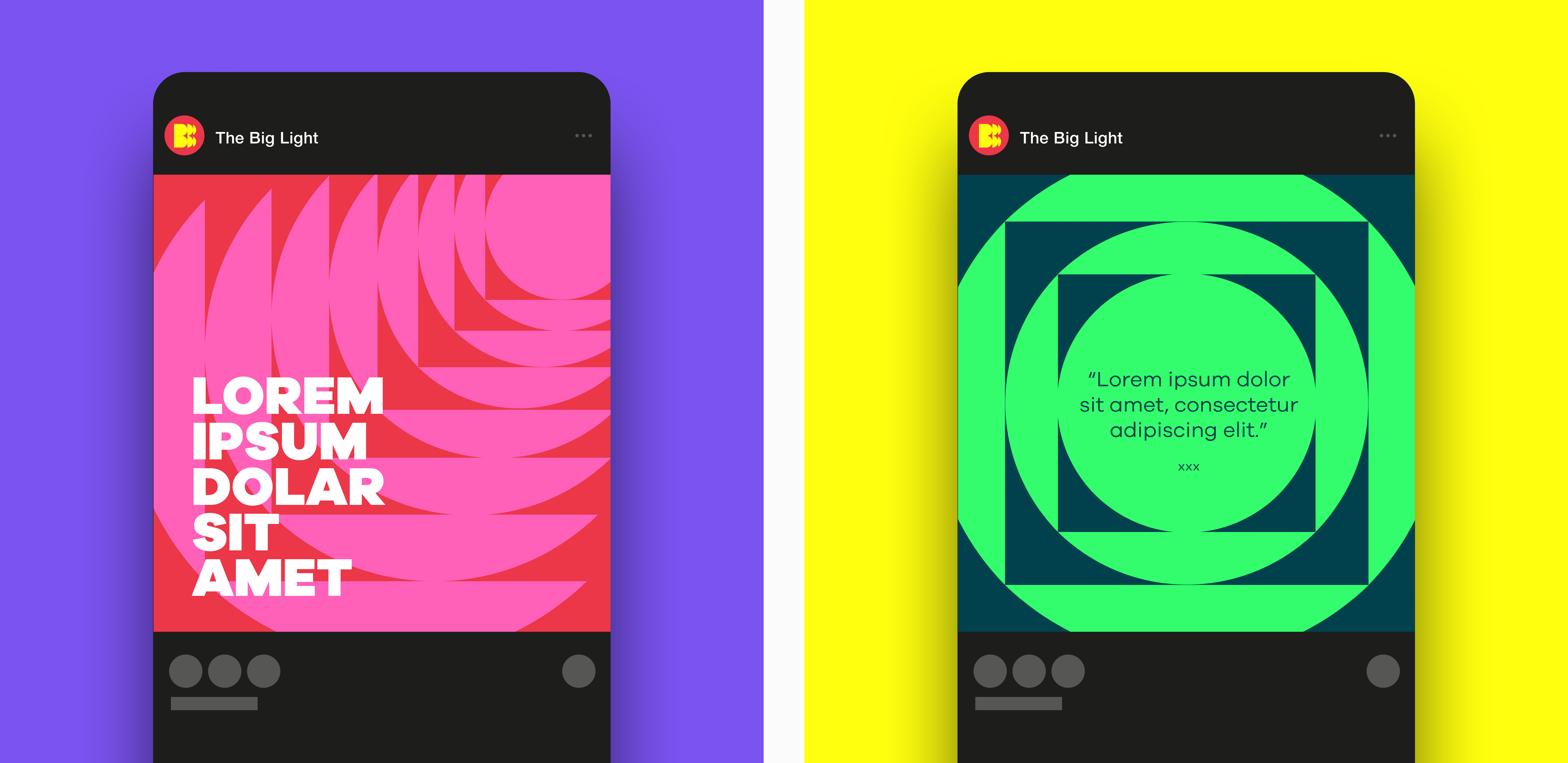
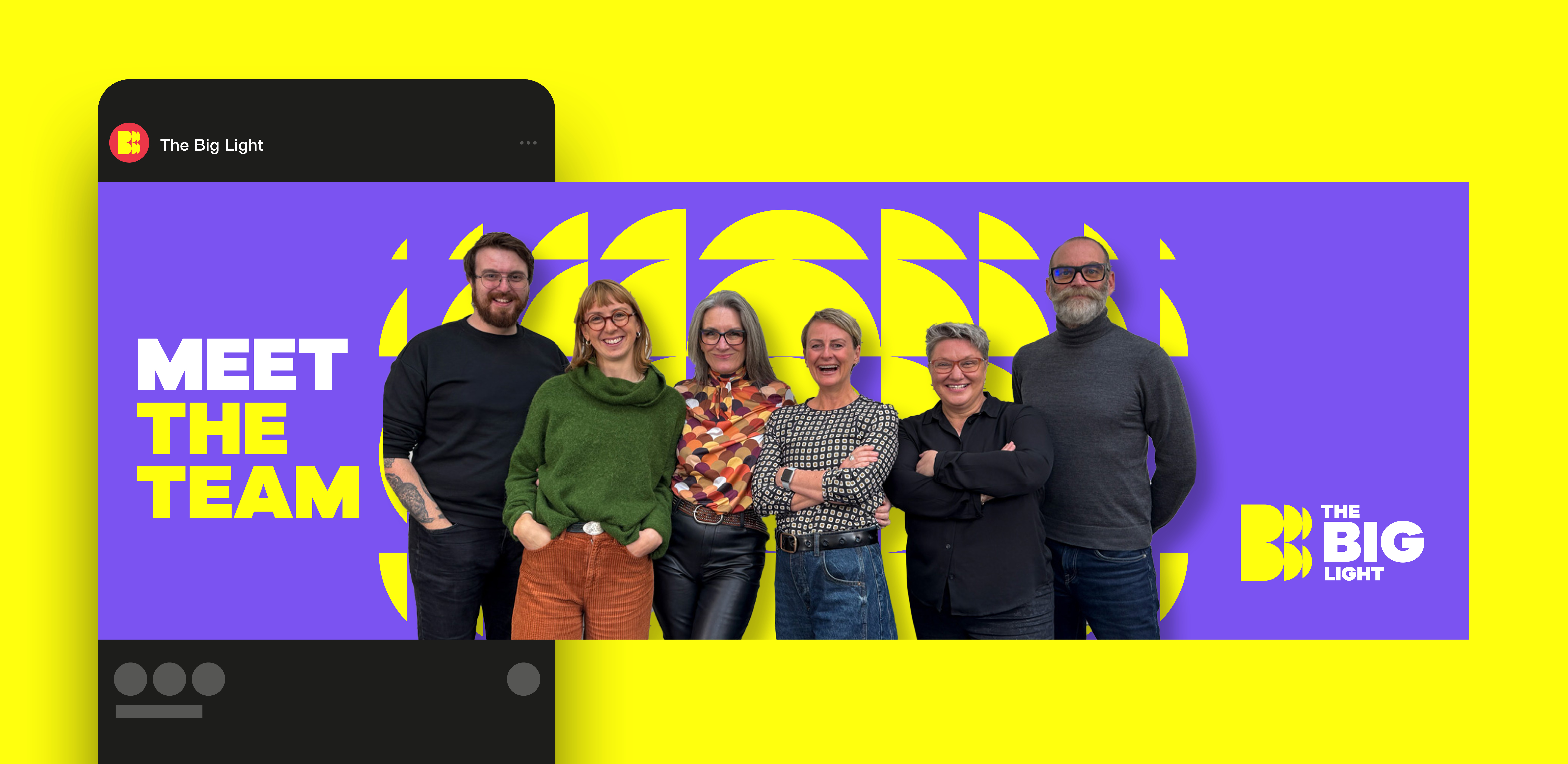
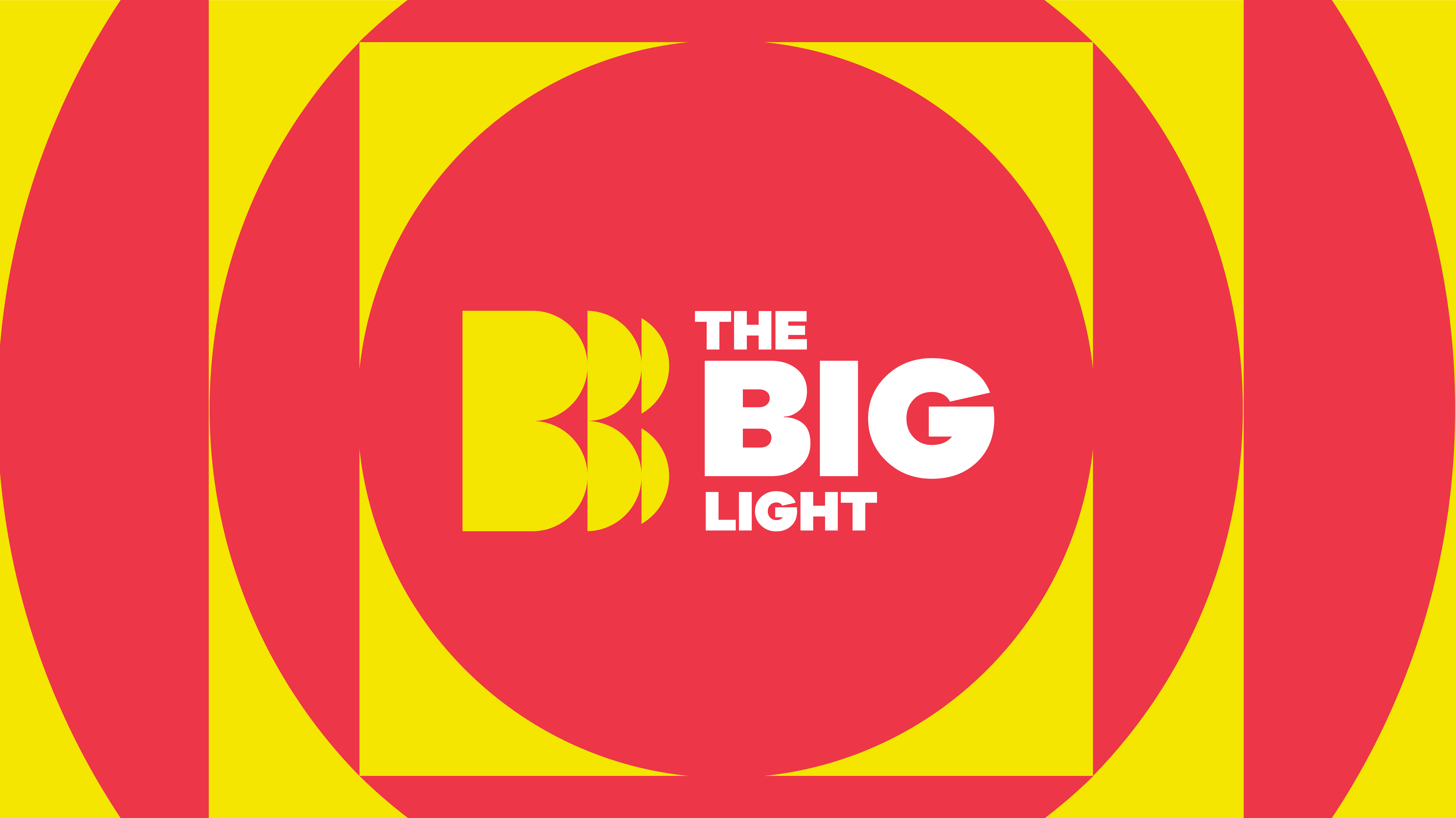
Drawing inspiration from the intricate patterns of a lighthouse lens, I designed a logo that seamlessly blends light and sound in a visually compelling way. To capture the concept of "freeing audio," I focused on creating a sense of radiating energy and fragmentation, where shapes break apart and evolve. This dynamic visual language extends throughout the brand world, featuring a vibrant colour palette and a set of patterns that echo the core principles of the monogram. The result is a bold, attention-grabbing brand that challenges convention and dares to be different.


