Client: EST
Job: Energywise
Branding
Background
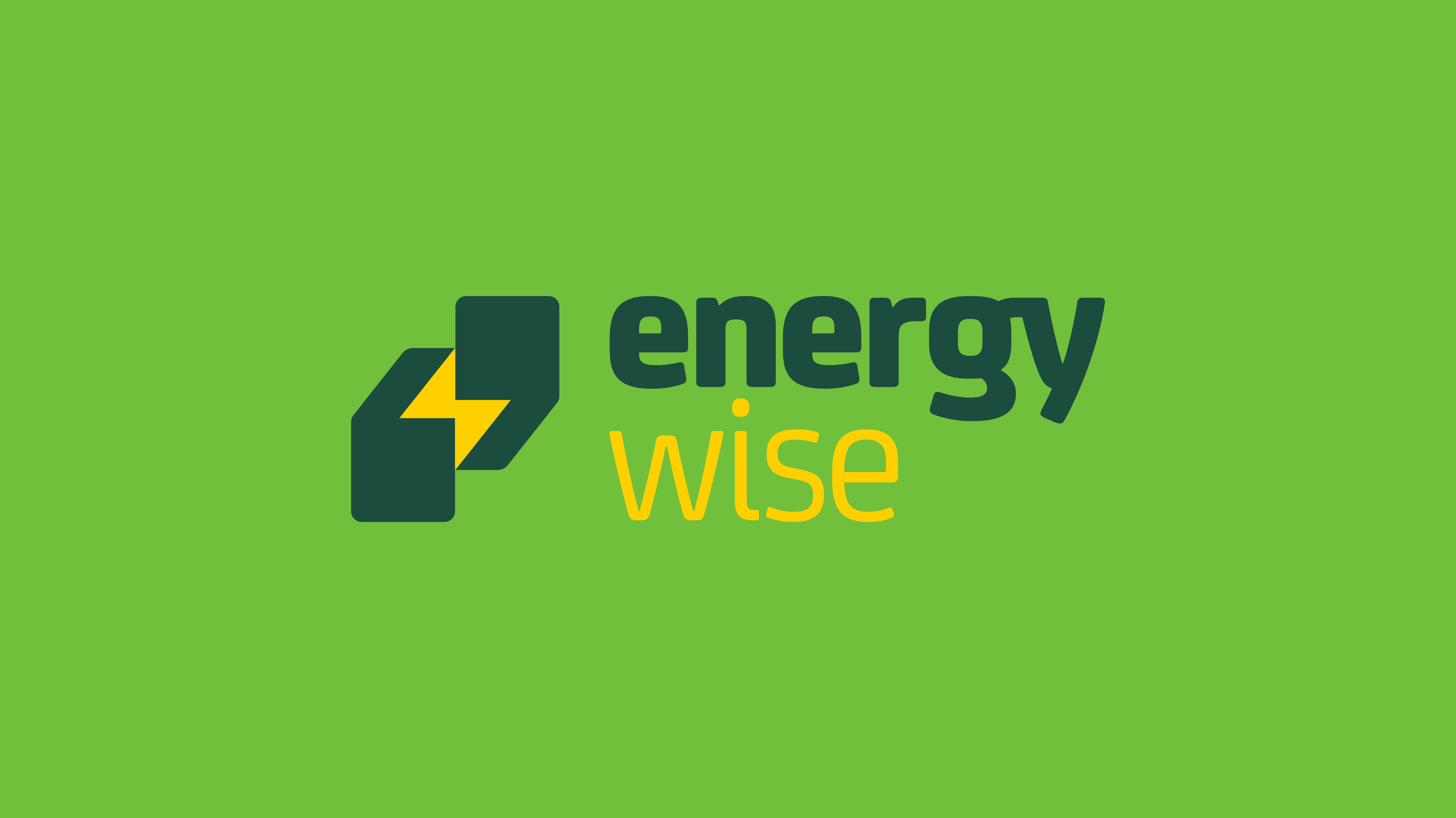
As part of a pitch process, the Energy Saving Trust sought a fresh branding concept and campaign to launch their new sustainable energy advice service, Energywise. I was entrusted with developing the logo and the supporting brand system. The brief called for the new logo to a feel fresh while still maintaining a clear connection to the core identity of the Energy Saving Trust.
The Solution
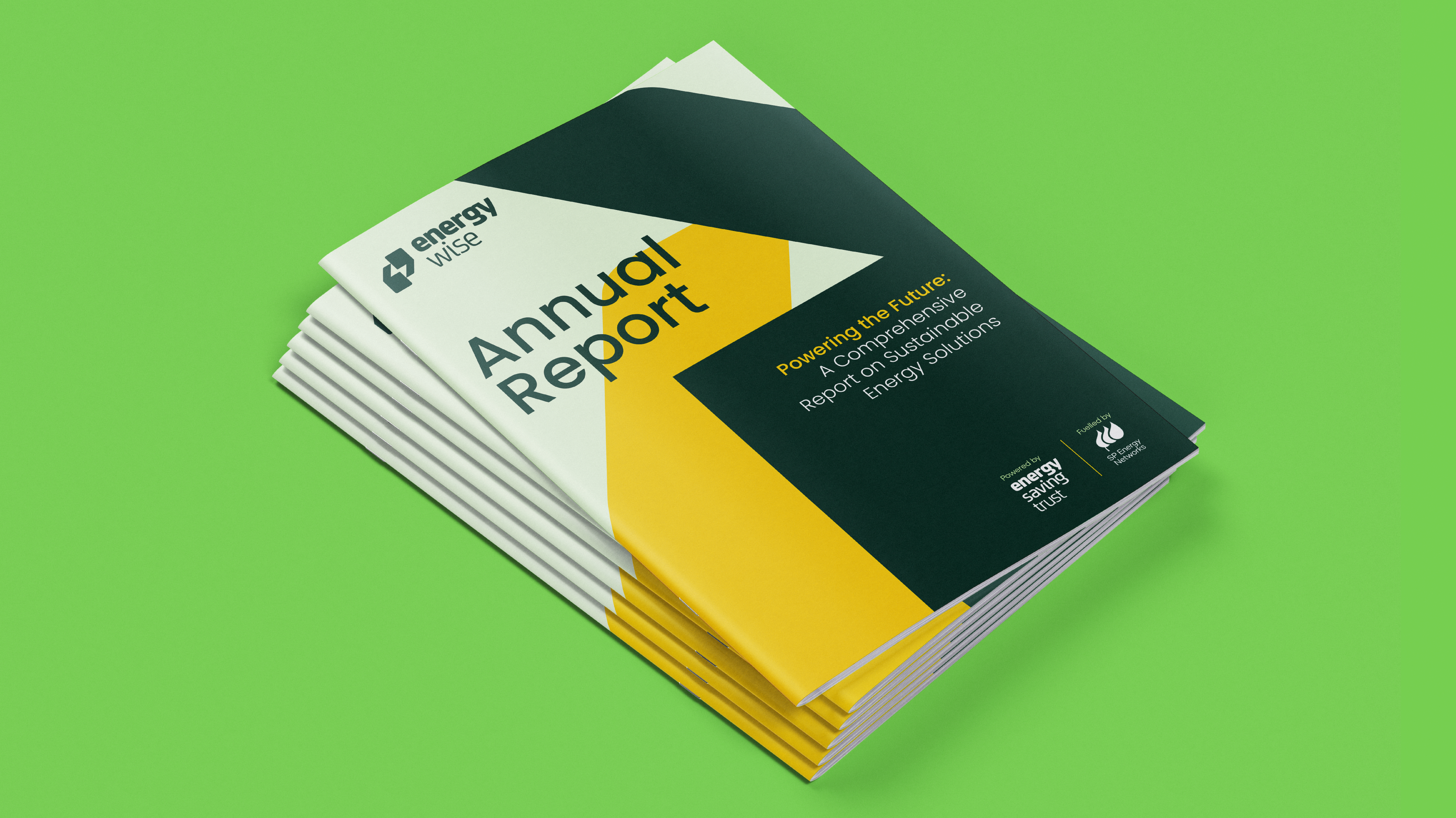
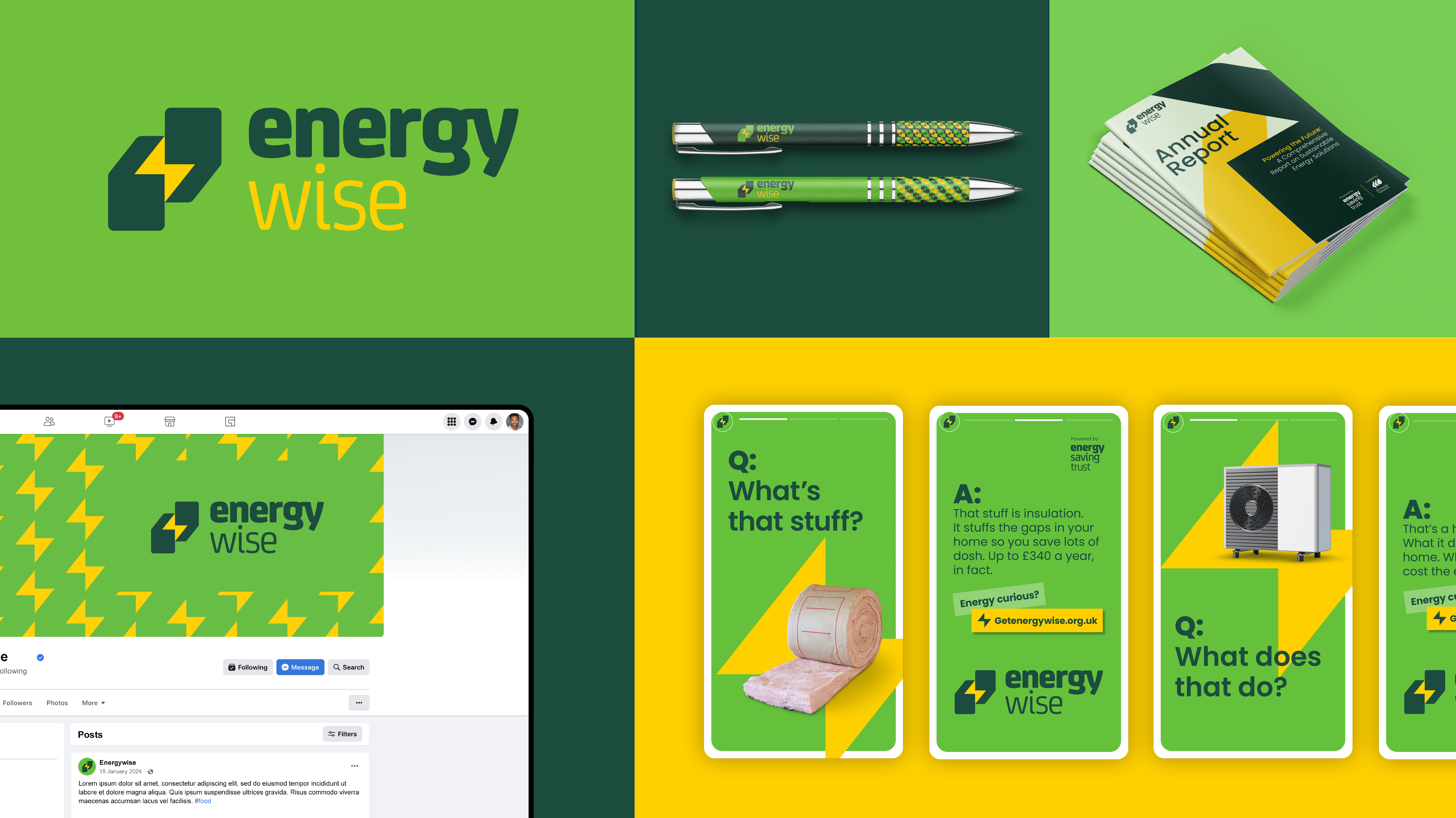
For the logo, I created a clever visual fusion of two key elements: energy, represented by a lightning bolt, and advice, symbolised by quotation marks. This combination forms a unique, instantly recognisable motif, with each element flexible enough to be used individually within the broader brand system. To reinforce the brand's values, I carefully selected a palette of green tones to evoke sustainability, complemented by a vibrant yellow to signify energy enlightenment.
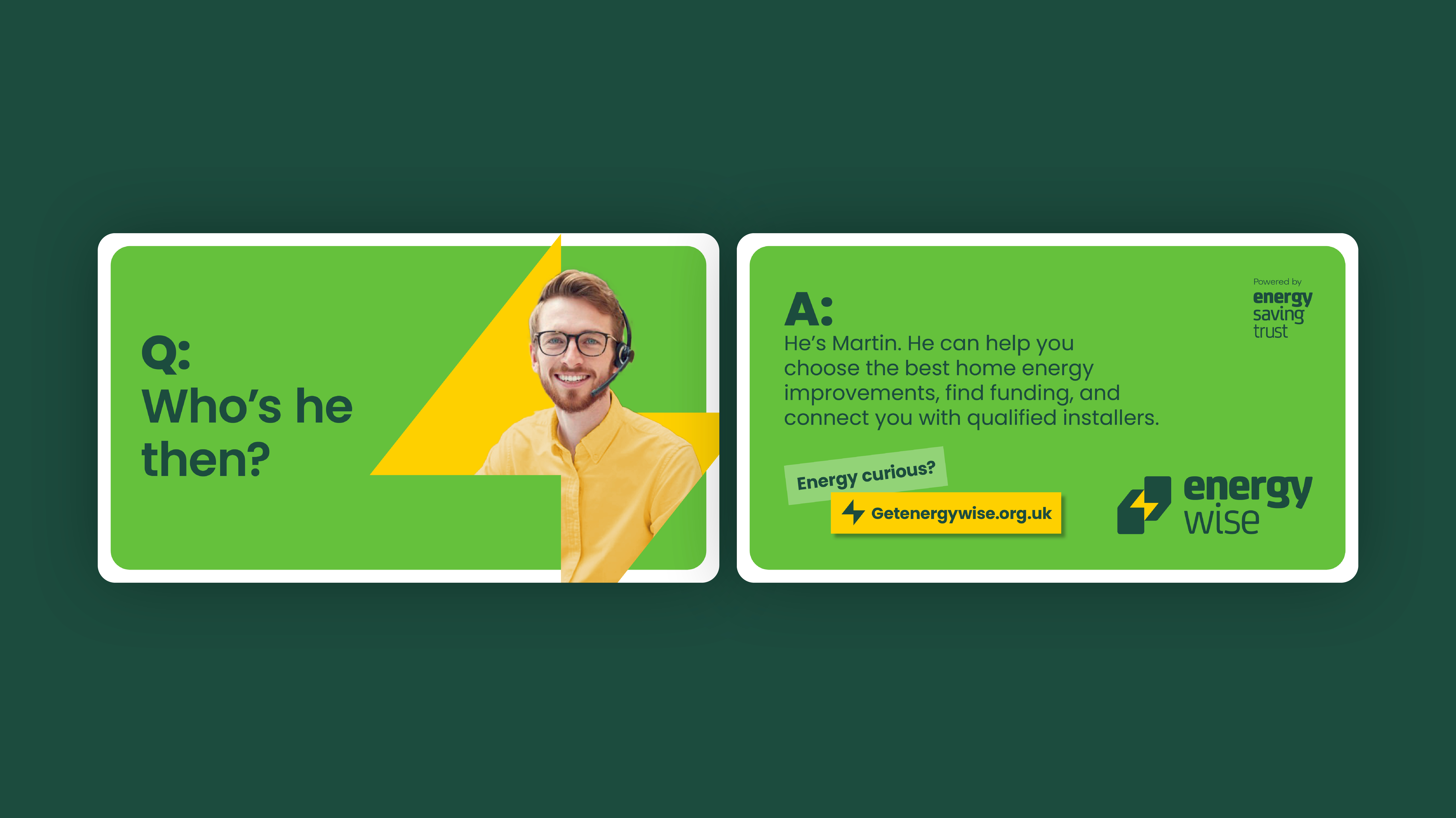
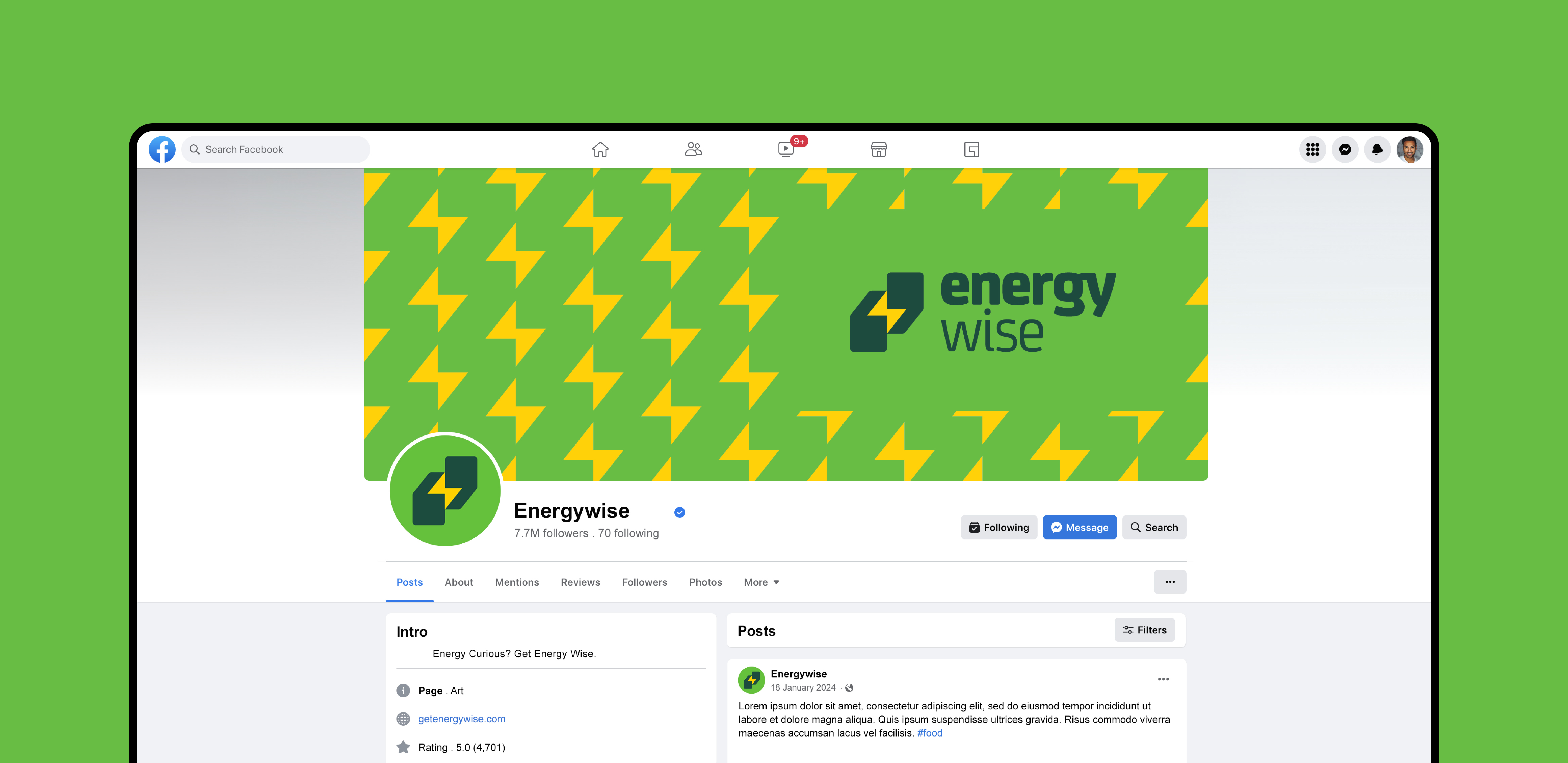
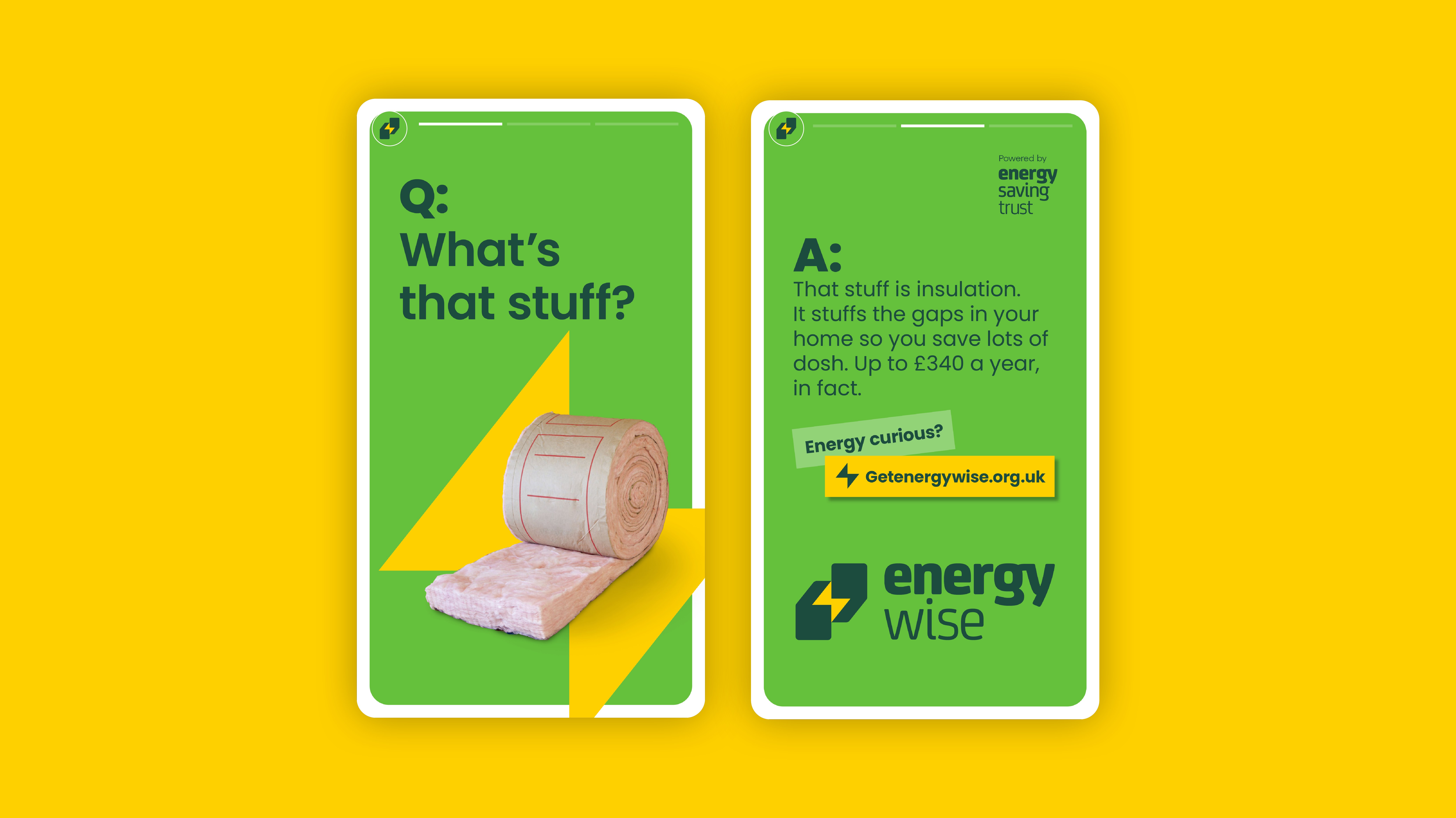
This new, flexible brand system comes to life by incorporating elements from our motif to frame photography within the campaign, alongside a set of bold graphic patterns that inject visual texture and energy across all brand touchpoints. The result is a cohesive, visually distinctive brand world that feels dynamic and unified.
