Client: ABZ
Job: Brand World
Branding Campaign
Background
Part of the AGS Group, Aberdeen Airport serves the surrounding areas of Aberdeenshire and handles over 2 million passengers annually. With 15 airlines offering flights to over 30 destinations, it stands out as a more convenient alternative to larger nearby airports. Retaining their existing logo, I was tasked to develop a brand world that would captivate and inspire new customers, while highlighting the key benefits of flying from Aberdeen—namely, its ease, accessibility, and customer-centric service.
The Solution
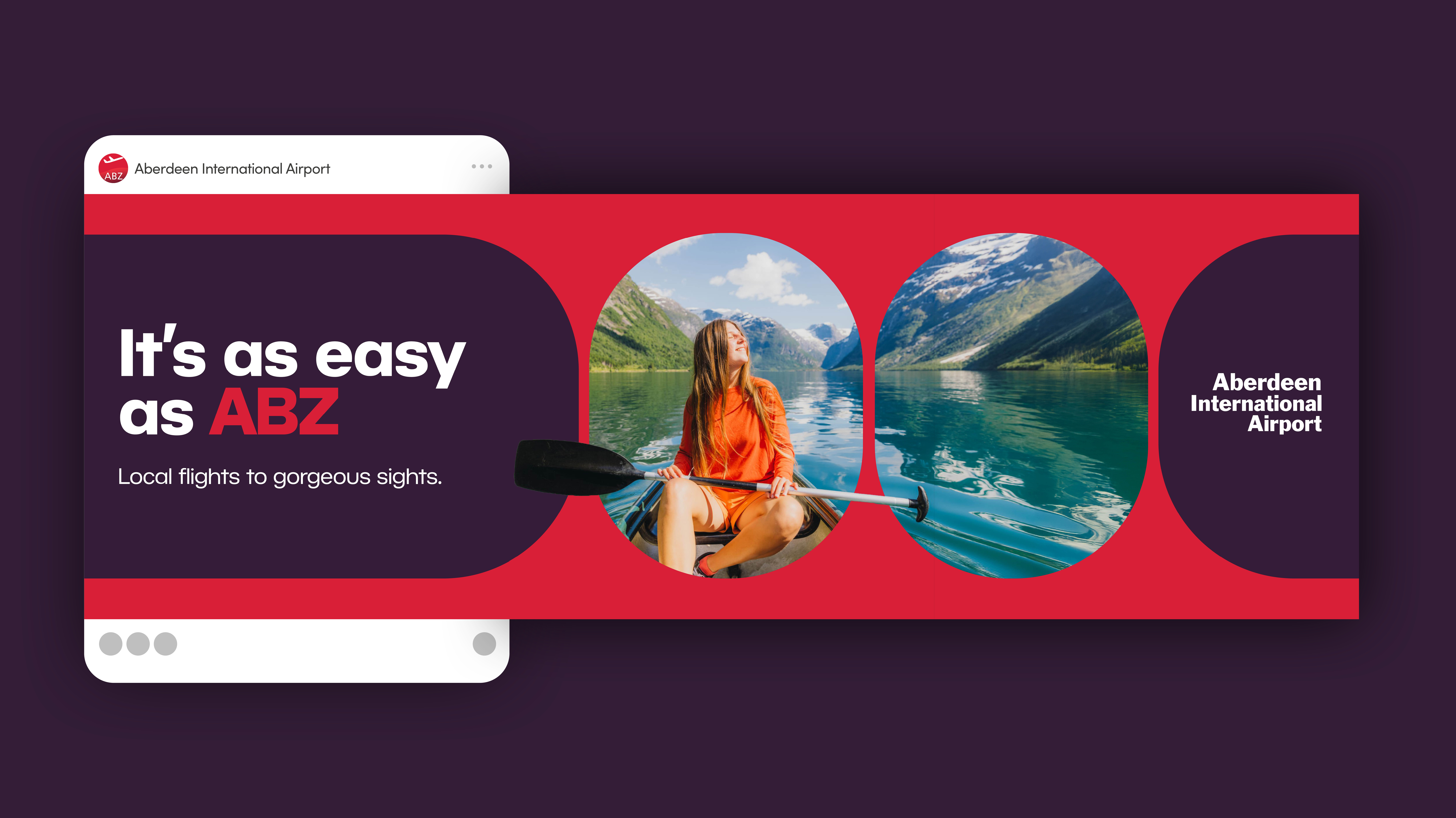
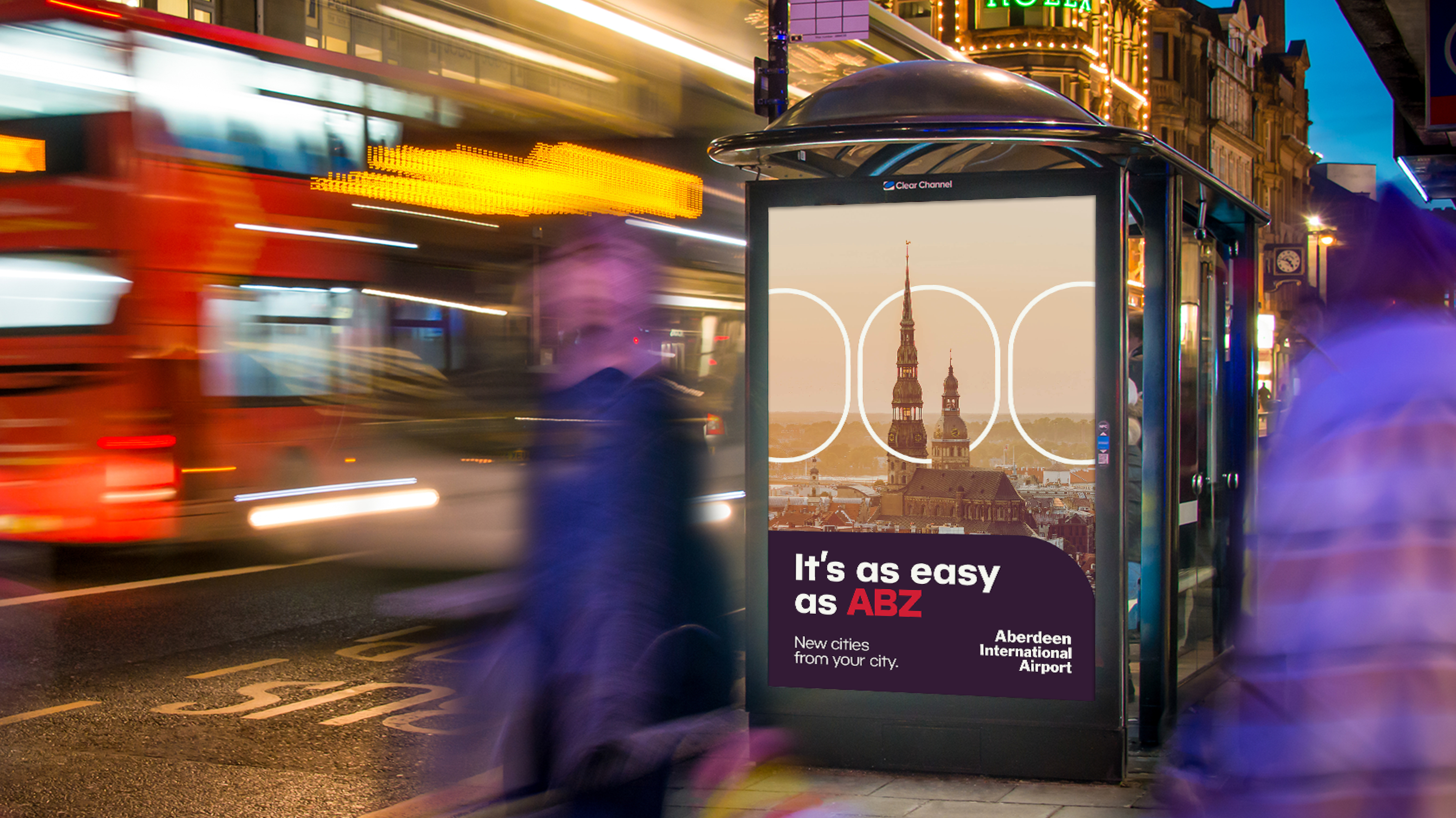
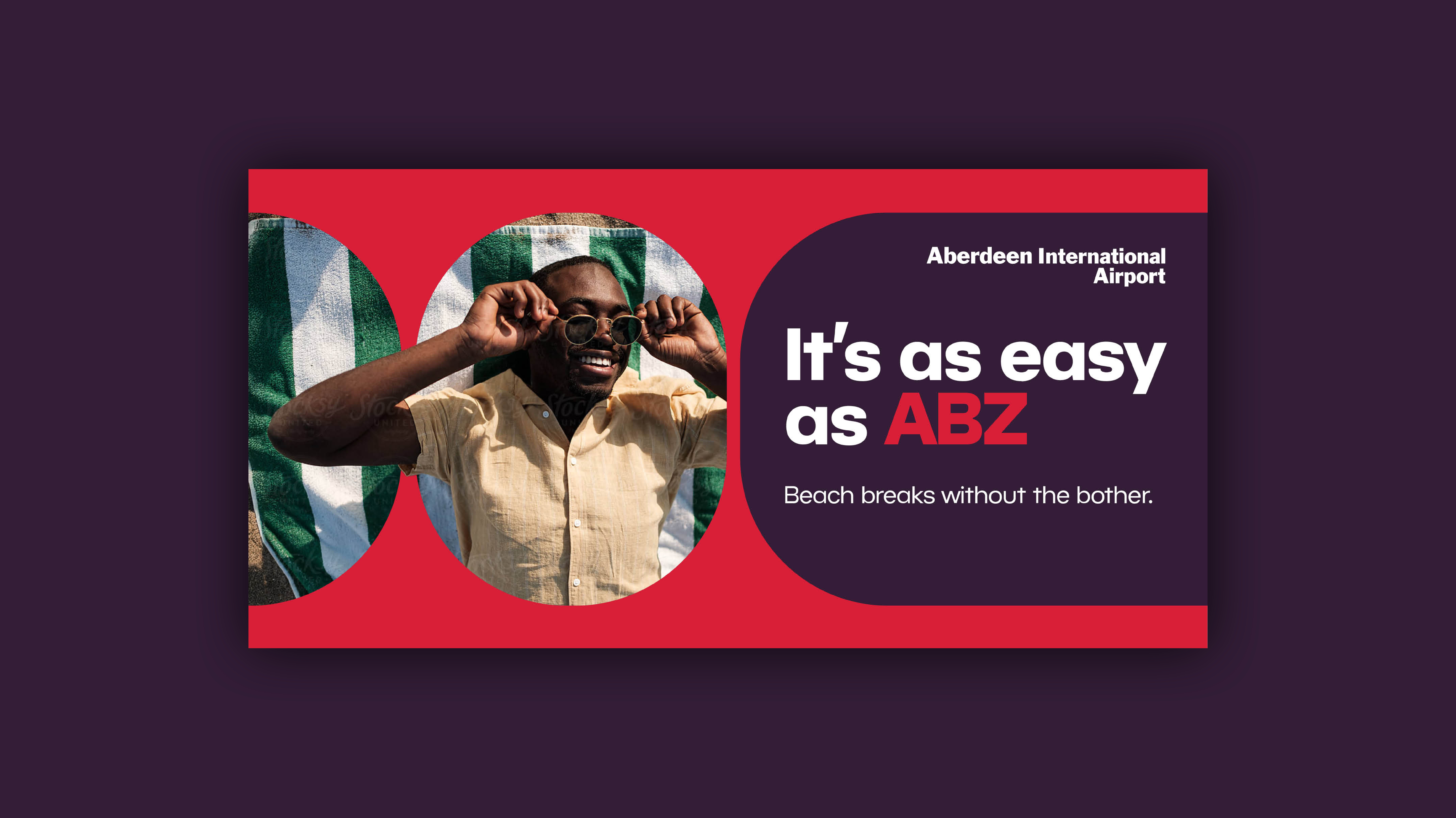
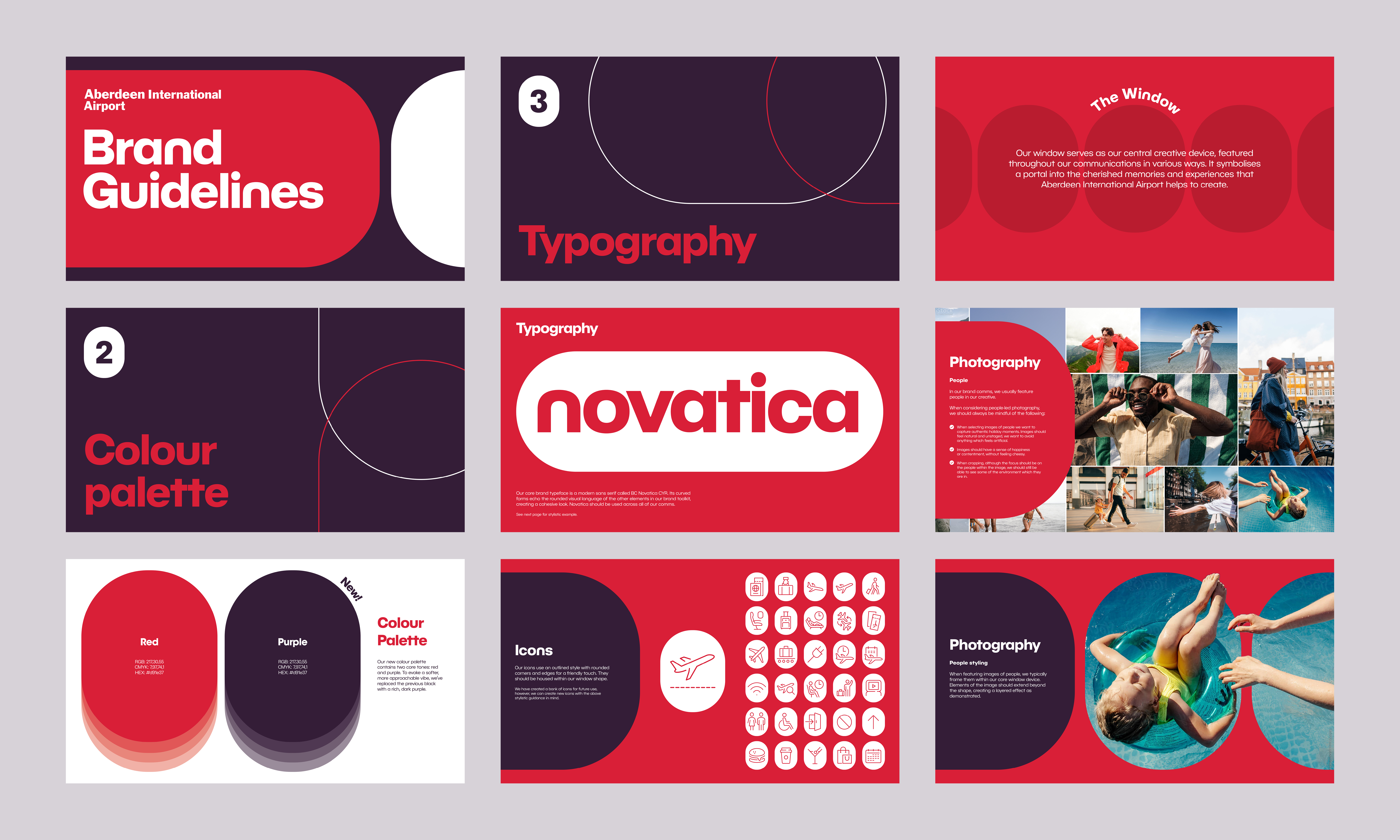
The brand world I’ve developed revolves around the iconic shape of a plane window. This distinctive element serves as our central creative device, seamlessly integrating into our communications in a variety of ways. The window acts as a symbol—a portal into the cherished memories and experiences that Aberdeen Airport helps bring to life, inviting travellers to embark on their journeys.
To complement this central motif, I refreshed the typography with a clean, rounded sans serif font that aligns with the brand's new visual language. The client wanted to maintain a limited colour palette, so I preserved the signature red, which is deeply associated with Aberdeen Airport, while softening the stark black with a warmer, more inviting purple tone.
In addition, I curated a collection of authentic, emotive photography that feels natural and unposed. These images capture the genuine moments of joy and anticipation that come with travel, designed to resonate with customers by reflecting the real, unforgettable moments that make holiday memories so special.


